Grant Pedersen · Product designer · New York
Minerva’s Tools
45 tools for everyday design and development, built around a shared interface.
Product design & frontend engineering · Independent product · 2026
Scaling a toolkit to 45 utilities without fragmenting the UI
Single-purpose web utilities for checking contrast, pairing fonts, compressing images, or formatting data are usually scattered across ad-heavy sites with inconsistent controls. I designed and built Minerva’s Tools to bring 45 design and development utilities into one cohesive product.
Every tool runs locally in the browser without an account. To keep 45 different workflows feeling like one product, I designed a shared shell for navigation, input controls, live previews, and copy-or-download outputs.
Redesigning discovery and mobile layout for 45 tools
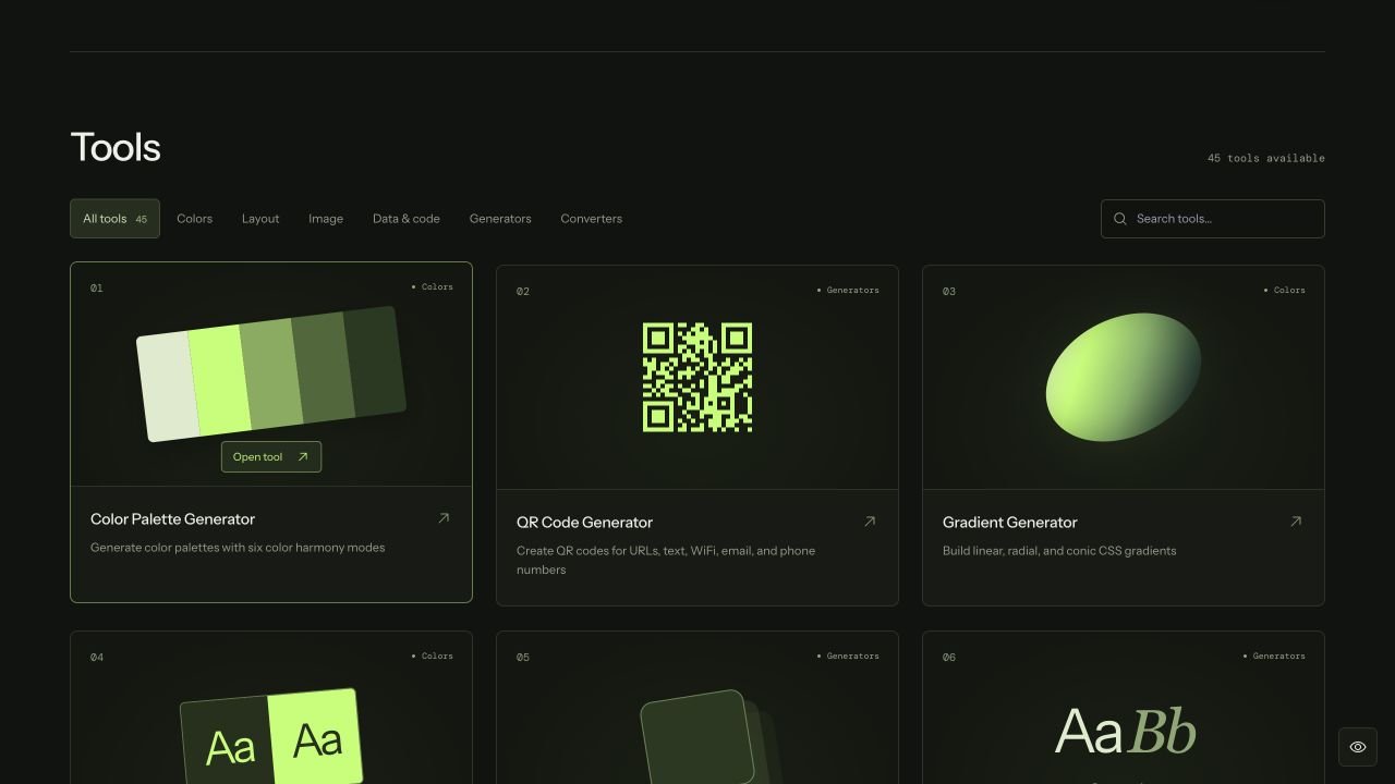
As the catalog grew to 45 tools across six categories, a simple text list made it hard to tell similar utilities apart. In the September 2026 redesign, I paired each tool card with a visual preview and short summary, and grouped desktop navigation by category while using expandable lists in the mobile drawer.
On phones, a multi-column grid cramped both the preview artwork and the tool descriptions. Switching mobile to a single-column card layout kept both readable at a glance and gave tool controls room to stack cleanly above their live output.
Testing gradients against real interface content
A gradient often looks balanced in a color swatch but makes text unreadable when applied to a layout. Instead of showing only a raw color field, I placed the gradient swatch beside a live page specimen with heading copy, body text, and a button.
Draggable stops support quick visual exploration, while synced numeric percentage fields allow exact stop alignment. Both views share the same underlying CSS string ready to copy.
Evaluating typography across hierarchy and measure
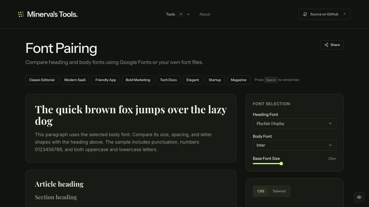
Judging a font pairing from a single alphabet line hides how the type behaves in real layouts. I structured the Font Pairing workspace around a hero heading, a long-form article column, and compact UI cards so designers can inspect scale, line height, and weight contrast simultaneously.
Users can compare Google Fonts alongside locally uploaded font files (which stay on the device) and export the resulting scale as CSS variables or Tailwind settings.
Accessibility preferences, local privacy, and release verification
I built a persistent accessibility menu into the shared shell so visitors can adjust text size, contrast, motion, font style, and spacing across all 45 tools. Page and drawer animations respect both system reduced-motion settings and the in-app override.
Ahead of the September 2026 release, I wrote 45 automated regression tests (catching edge cases like custom font filename parsing and WebAssembly initialization in the HTML minifier) and audited every tool across phone, tablet, and desktop viewports, logging enlarged-text layout fixes for follow-up releases.